Creating a visually compelling interior is about more than choosing pretty furniture or trendy colors. One of the most powerful tools in interior design is contrast in interior design. By balancing light vs dark decor, you can achieve spaces that feel bold, dynamic, and deeply engaging. Whether you’re drawn to moody design or simply want to bring more personality into your home, understanding how to use high-contrast color schemes is essential.
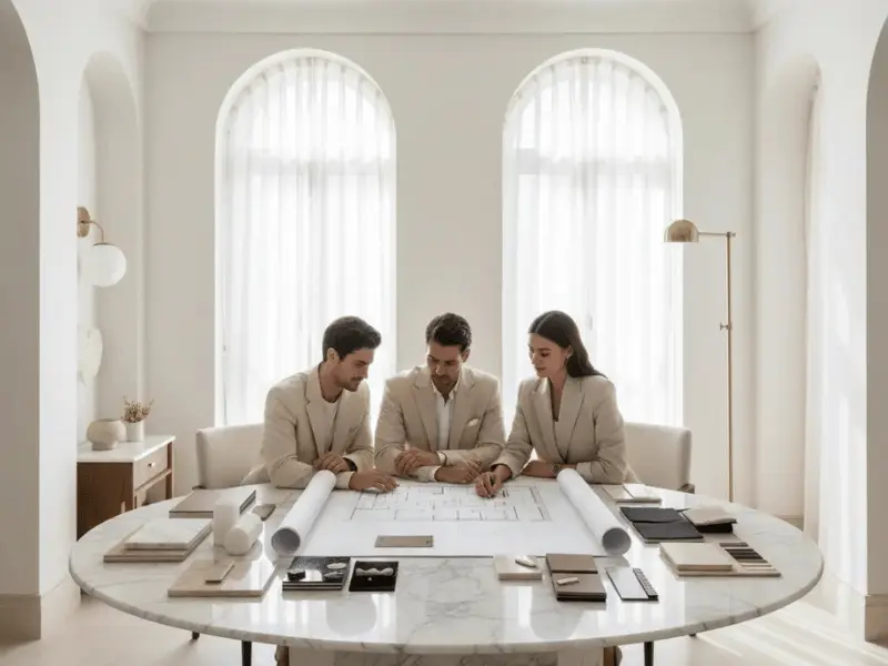
At Sierra Contracting, we help homeowners in Dubai craft interiors that combine functionality with striking aesthetics. In this guide, we’ll explore how to use contrast thoughtfully, create bold interiors, and transform any room into a visually stimulating space.
👉 Related: Designing Around Natural Light: Placement, Color, and Materials
Why Contrast Matters in Interior Design
Contrast is not just about aesthetics—it’s about how a space feels. A room with well-applied contrast draws the eye, defines key areas, and creates depth. Here’s why contrast is essential:
- Adds visual interest: Light and dark elements make a room feel layered and engaging.
- Highlights architectural features: Contrasting walls or furniture can emphasize windows, doorways, or ceilings.
- Defines zones: In open-plan layouts, contrast helps subtly separate different areas without physical barriers.
- Evokes mood: Dark hues bring intimacy and coziness, while light shades open up a room and create airiness.

Understanding Light vs Dark Decor
The first step in mastering contrast in interior design is understanding how light vs dark decor affects a space.
Light Colors
- Visual expansion: Light walls and furniture make rooms feel larger and more open.
- Reflective quality: They bounce natural light around, brightening spaces naturally.
- Neutral canvas: Light tones provide a perfect base for pops of color or darker accents.
Dark Colors
- Intimacy and warmth: Deep hues like navy, charcoal, or forest green create a cozy, enveloping atmosphere.
- Sophistication: Dark finishes often feel luxurious and timeless.
- Anchor elements: Dark furniture or walls can ground a space and give it structure.
Balancing light and dark is key. For instance, pairing a dark sofa against light walls keeps the room from feeling heavy while maintaining a sense of depth.
How to Create High-Contrast Color Schemes
High-contrast color schemes don’t have to be overwhelming. Thoughtful planning is essential.
- Start with a Base
Choose a neutral or muted base color for walls, flooring, or large furniture pieces. This serves as a canvas that balances your darker accents without feeling chaotic.
- Layer in Dark Accents
Introduce dark tones through:
- Furniture: Sofas, armchairs, and tables in dark finishes.
- Accessories: Throw pillows, rugs, or curtains.
- Architectural details: Dark cabinetry, doors, or built-in shelves.
- Use Light Accents for Pop
Contrast isn’t complete without lighter elements to create balance:
- Light-colored artwork or mirrors.
- Pale textiles like throws, bedding, or cushions.
- Bright lighting fixtures that reflect off dark surfaces.

Bold Interiors: Making a Statement
Bold interiors embrace daring choices while maintaining harmony. Here are some strategies:
Statement Walls
- Paint one wall a deep, rich color while keeping the others light.
- Add texture with wall panels or wallpaper in contrasting shades.
Furniture Pairings
- Combine sleek dark wood with cream or beige upholstery.
- Mix metals like black steel and brushed gold for a subtle contrast.
Layering Textures
- Velvet cushions against linen sofas.
- Glossy tiles with matte cabinetry.
By layering color and texture, you create rooms that are visually dynamic yet cohesive.
Creating Mood with Contrast
Contrast influences how a room feels emotionally.
- Moody design: Dark walls, dim lighting, and metallic accents create intimacy.
- Energizing spaces: Bold black-and-white contrasts or saturated colors energize kitchens, offices, and entertainment areas.
- Balanced tranquility: Pairing mid-tone walls with darker accents and lighter furnishings can create a serene environment.
Lighting also plays a major role—natural light softens dark tones, while layered artificial lighting highlights key features.

Tips for Using Contrast in Different Rooms
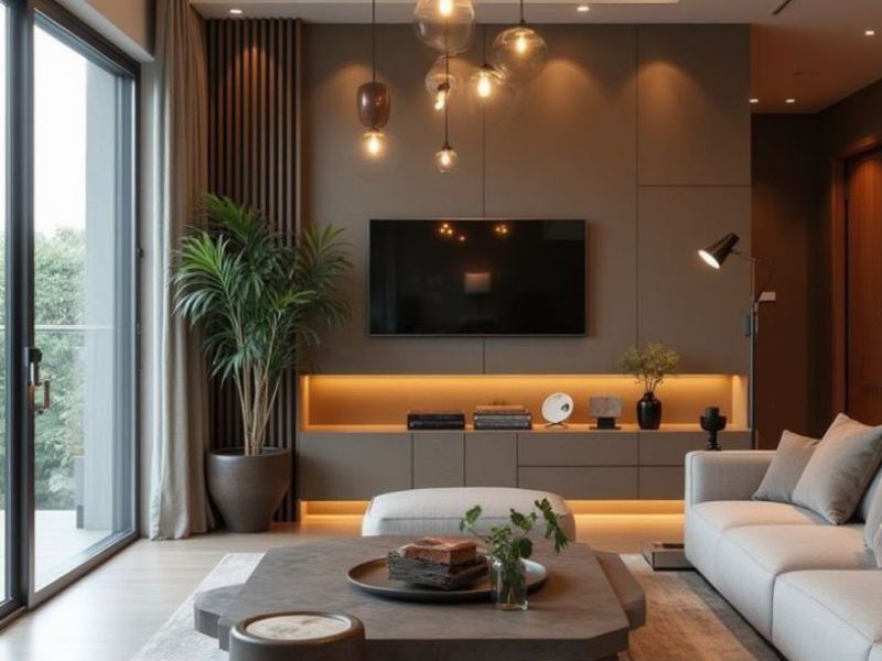
Living Rooms
- Dark sofas against light walls create a focal point.
- Use rugs and cushions to introduce secondary contrasts.
Bedrooms
- Dark headboards or feature walls with light bedding create a restful yet stylish space.
- Incorporate metallic or wood accents to add depth.
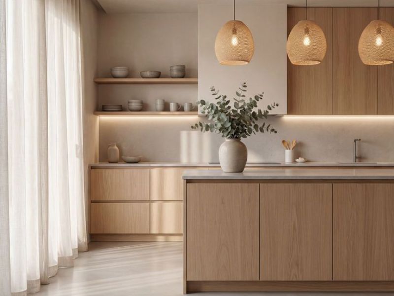
Kitchens
- Dark cabinetry with light countertops keeps spaces bright but sophisticated.
- Add contrasting backsplashes or fixtures for visual interest.
Bathrooms
- Matte black fixtures against white tiles create a high-end, bold interior feel.
- Consider contrasting mirrors or lighting to highlight design features.
Common Mistakes to Avoid
- Too much dark: Rooms can feel heavy and oppressive without balance.
- Ignoring lighting: Proper illumination is essential for dark tones to shine.
- Clashing contrasts: Colors that compete instead of complement create visual chaos.
Focus on harmony—contrast should feel deliberate, not accidental.
Final Thoughts
Using contrast in interior design allows you to create rooms that are dynamic, stylish, and emotionally resonant. From light vs dark decor to moody design and high-contrast color schemes, thoughtful combinations make interiors feel layered and intentional. By integrating these strategies, your home can have bold interiors that capture attention while remaining comfortable and livable.
At Sierra Contracting, we specialize in helping Dubai homeowners achieve this balance, designing spaces that are both functional and visually striking.
👉 For more inspiration, explore: Designing Around Natural Light: Placement, Color, and Materials