Color has the power to make or break a home’s design. When used thoughtfully, it can guide the eye, define purpose, and evoke emotion. But when mismatched or overdone, it can leave a space feeling chaotic and disconnected.
That’s where the idea of a cohesive color palette home comes in. Whether you’re designing a compact apartment or a multi-level villa in Dubai, building harmony across your spaces using color is one of the simplest and most effective ways to elevate your interiors.
In this guide, we’ll break down how to create coordinated interiors using smart color transitions and well-planned whole-home color schemes that feel both natural and intentional.
✅ Related: What Colors Go Together in Interior Design?
Why a Cohesive Color Palette Matters
When colors flow from one room to the next, your home feels bigger, calmer, and more pulled-together. It’s not about using the same colors everywhere, but rather choosing shades that complement each other and serve a purpose in each space.
A cohesive color palette home provides:
- Visual balance from room to room
- Easier decorating decisions for furniture and accents
- Increased property value thanks to well-designed spaces
- A natural sense of harmony and calm throughout the house
In fast-paced urban environments like Dubai, where homes serve as sanctuaries from daily chaos, this sense of cohesion is more important than ever.
Step 1: Start With a Color Foundation
Choose a Dominant Neutral
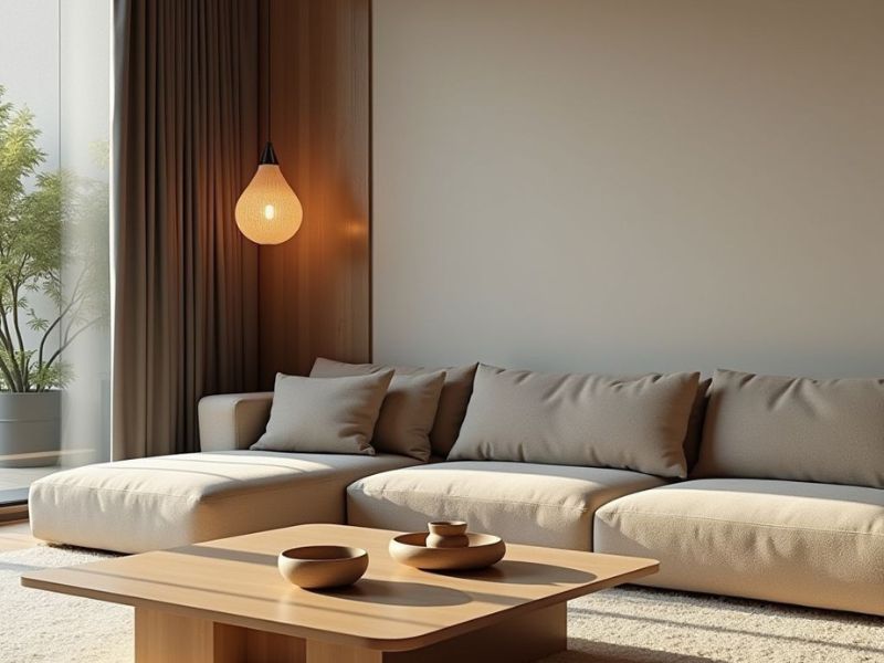
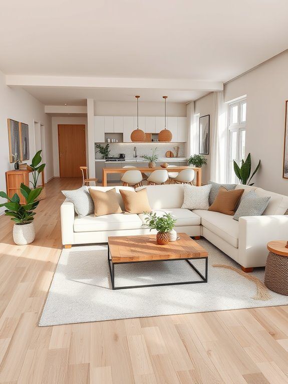
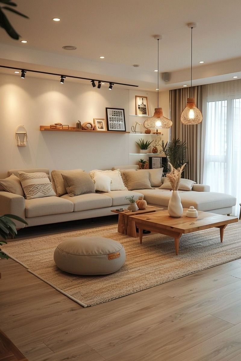
Every great color story starts with a base. This is usually a neutral tone that appears in multiple places across your home—think soft white, warm beige, light grey, or even pale taupe.
This color becomes your visual anchor. You can use it on walls, ceilings, trim, or larger furniture pieces. It creates consistency and gives you a backdrop for layering more vibrant or distinct tones in each room.
Understand Undertones
Even neutrals have undertones—cool greys with blue hues, or warm beiges with yellow or pink undertones. Matching undertones is essential for smooth color transitions.
If you choose a cool base, stick with other cool shades. If you pick a warm tone, keep the rest of your palette in that family.
Step 2: Plan Your Whole-Home Color Scheme
Creating whole-home color schemes doesn’t mean everything has to match. Instead, think in terms of relationships:
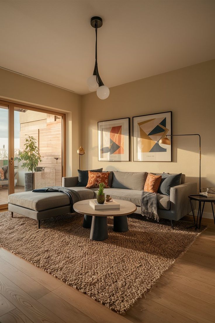
Try the 60-30-10 Rule
This classic interior design rule helps keep color balance in check:
- 60% of a dominant color (usually a neutral or wall color)
- 30% of a secondary color (used in upholstery, rugs, or cabinetry)
- 10% of an accent color (pillows, artwork, vases, etc.)
This mix keeps things interesting without feeling overwhelming.
Use a Color Wheel for Guidance
If you’re not sure how to pair colors, a simple color wheel can help. Some combinations to try:
- Analogous: Colors that sit next to each other (blue, teal, green)
- Complementary: Colors opposite each other (navy and orange)
- Monochromatic: Different shades of the same color family
Each approach can work beautifully—just keep it consistent from room to room.
Step 3: Consider Color Transitions Between Rooms
One of the biggest challenges homeowners face is making the colors in one room blend naturally with the next. Smart color transitions are key here.
Use Connecting Elements
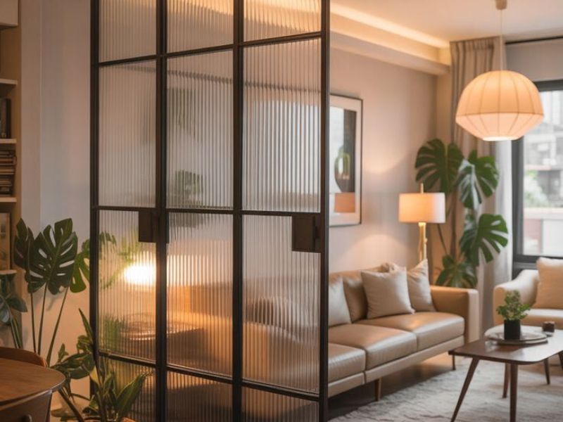
- Paint trims, doors, or ceilings the same color throughout the house
- Repeat materials like flooring or tile to visually tie rooms together
- Use a favorite color as a subtle accent in each room—like a navy pillow in the living room, navy towels in the bathroom, and a navy print in the bedroom
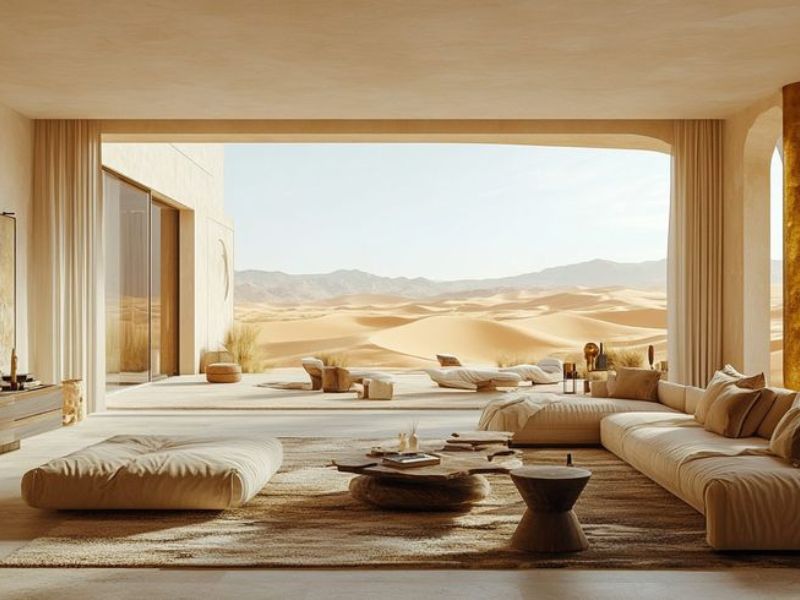
Open Plan? Keep It Light
For open floor plans, cohesive color flow is critical. Choose a soft, light base that allows furniture, textiles, and accents to introduce depth without clashing.
You don’t want one side of the room feeling beachy while the other feels moody and dark—it can break the space emotionally and visually.
Step 4: Add Variety Through Textures and Tones
A cohesive color palette doesn’t mean boring or flat. You can still mix things up!
Layer in Textures
Even if you’re using mostly neutral colors, introducing texture—linen curtains, leather furniture, woven rugs, glossy tiles—brings dimension to your design.
Play With Light and Shadow
Paint the same color in different finishes (matte vs. satin) or use it in different lighting environments. You’ll be surprised at how different it can look, and how that variation adds richness to your palette.
Step 5: Rooms That Can Break the Rules (A Little)
While you want a unified vibe, it’s okay for some rooms to have their own personality.
Powder Rooms or Home Offices
These are perfect places to use bolder hues or pattern. Think jewel tones, wallpaper, or statement tile. Because they’re often smaller or self-contained, they won’t disrupt the overall coordinated interiors look.
Kids’ Rooms
You can still tie in elements from your whole-home palette while letting the kids’ spaces have more fun with color. Use accent pieces, bedding, or wall decals that echo tones found elsewhere in your home.
Common Mistakes to Avoid
- Using too many unrelated colors that feel disconnected
- Painting each room a drastically different color
- Ignoring the color of fixed elements like flooring, cabinetry, or countertops
- Forgetting to test paint in natural and artificial lighting
Remember: It’s not just about how a color looks in the can—it’s how it lives in your space.
Let Sierra Contracting Help You Pull It All Together
At Sierra Contracting, we’ve helped hundreds of Dubai homeowners and property developers create color palettes that tell a story—from luxury villas to modern apartments. We understand how to balance boldness with flow, contrast with calm.
If you’re starting a renovation or building from scratch, our team can help craft a cohesive color palette that fits your lifestyle, your personality, and your architecture.
🔗 Explore: What Colors Go Together in Interior Design
Final Thoughts
Creating a cohesive color palette home isn’t about following trends—it’s about making your space feel intentional, balanced, and uniquely yours. With smart planning and just a little creativity, your home can feel both connected and full of character.
Whether you’re building new or refreshing a few rooms, always start with color. It’s the first thing people notice, and the last thing they forget.